Great logos and ideas
- Queries
- All Stories
- Search
- Advanced Search
Advanced Search
Mar 29 2017
Mar 5 2017
Mar 3 2017
Mar 2 2017
Build tested in clean VM, documentation added and adjusted -> https://wiki.apertus.org/index.php/OpenCine.Build_Instructions
Mar 1 2017
Removed old stuff, added links to Wiki and Lab. Started to adjust Wiki also.
Merged branches.
Feb 28 2017
Feb 27 2017
Great progress guys, now i have to deliver the software, i suppose. Damn the pressure to succeed. :D
In T341#10809, @MichaelH wrote:
Some exploration in a slightly different direction
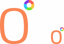
In T341#10796, @RexOr wrote:The following positioning allows for the colour wheel to sit precisely above the spine of the letter P when OpenCine is written fully.
The following positioning allows for the colour wheel to sit precisely above the spine of the letter P when OpenCine is written fully.
Warning: In this comment I will state some experiences I made with data wrangling (as it is lovingly called in the industry) and shamlessly post some vague GUI inspirations. When I shot my last film on a Blackmagic Production 4K Camera, I had a lot of RAW DNG streams to wrangle with – we recorded about 8TB in 10 days and those had to be backupped at least once. If one doesn't has a dedicated person on set to deal with the data flexibility is key.
^ Thing with that is the numbers woulnd't show if it was smaller. The cogs are here if anyone wants them - https://image.freepik.com/free-icon/data-management-interface-symbol-with-gears-and-binary-code-numbers_318-52331.jpg ... or there might be better ones out there.
Feb 26 2017
Current script, space for improvement:
Will try to integrate steps into automatic install script for OC development VM.
Looks good, especially on dark background.
Synthesis of old and new?
Sorry, I changed the order.
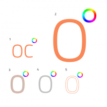
I like the second and the third one, but second one a bit more, as it's contrast makes it easier to recognize the letter C.
I think the general idea to integrate the C somehow within the O is a good one. I will certainly meditate about this one.
Great to see so many variations and progress here.
Very good, it will come handy, as the whole OC thing has to be polished up.
Here is the .ai with all the variants in seperate artboards, just for future reference
You know what? I'd say the same. Logos/icons is a really boggy area, and there are some great ones - AVID I think is particularly good. Sony vegas emulates it and I'm not sure that's a good idea. Then there are ones like DaVinci Resolve, where, yeah it's a nice icon, but it doesn't really have any relevance to the brand. Adobe have a very good, encompassing theme which makes incorporating new products into their CI very easy, then there's something like Final Cut Pro which is really generic and 90's looking. I'm still open to new concepts but what's happening here seems complementary, relevant and readily identifiable... so... you know. It's also something that would be easy to embellish and add detail to for larger promo material.
Looks very sleek. I know commercial projects who do worse : )
Another take:
Could you also upload this images without background, e.g. for launcher, where the buttons are styled by stylesheets? Thanks in advance.
Looks good, maybe you can prepare some of them as separate files, then i would include them so people get the idea.
Simple 0° for me too. Looked at my icon bar and noticed the thing might need some BG. Tried with scaling the weights of ring and "0" depending on size, I think a little bit lighter looks more sleek in this size. For a very small icon (16x16-ish), making it into a completely solid pie chart might be the way to go:
Simple 0° for me definitely.
Just a quick test in the launcher, haven't added proper handling of the size yet, so padding is off.
5 solid colours is a much better approach.
In T341#10751, @BAndiT1983 wrote:I like the lens idea, let's hear what other people think about it. Would also prefer "simple" design, as it's the trend nowadays.
I like the lens idea, let's hear what other people think about it. Would also prefer "simple" design, as it's the trend nowadays.
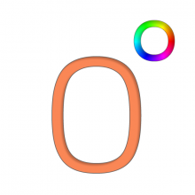
I added some drafts based on RexOr's inital design. First change is to replace the continous hue circle with one composed of 5 solid colors both in angle and in hue 72° apart (360/5 = 72). The colors of the hue circle have been desaturated to give a more modern look.
^ Here one can see that the smaller icon will need a seperate design with bolder shapes. Also the hue circle will need to be changed
Added basic player functionality, file path is hardcoded at the moment.
Feb 23 2017
Alright, time for apertus° stuff:
First success, used some sample footage with 4k and 2k.
Feb 20 2017
Feb 15 2017
Feb 13 2017
Feb 9 2017
Feb 8 2017
Feb 4 2017
Jan 22 2017
Jan 2 2017
Progress is now retrieved properly by copying file block-wise. Some evaluation of optimal block size has to be done.
Dec 31 2016
First tests with xxHash done, now the code will be split into useful chunks. After that bigger clenaup is on the list. If more algorithms are required later, then we need some extended interface and wrappers for xxHash and others.
Dec 30 2016
Dec 26 2016
Dec 24 2016
Dec 20 2016
I can help with RPM packages and submitting them (for OpenSUSE and Fedora).
Dec 15 2016
Dec 14 2016
Dec 11 2016
Nov 24 2016
Nov 20 2016
Nov 19 2016
Nov 18 2016
Nov 16 2016
Nov 13 2016
Have to check if it is fixed in rOPENCINE4219b140bf4c.


