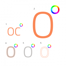
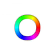
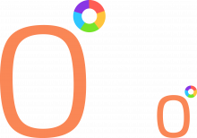
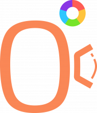
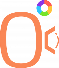
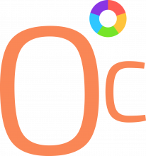
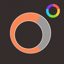
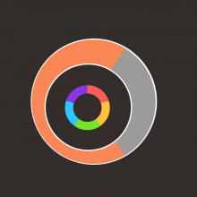
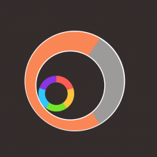
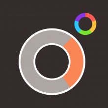
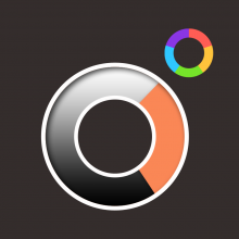
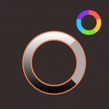
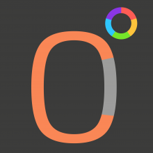
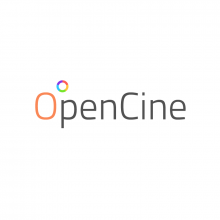
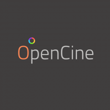
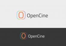
I added some drafts based on RexOr's inital design. First change is to replace the continous hue circle with one composed of 5 solid colors both in angle and in hue 72° apart (360/5 = 72). The colors of the hue circle have been desaturated to give a more modern look.
^ Here one can see that the smaller icon will need a seperate design with bolder shapes. Also the hue circle will need to be changed
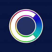
^ One idea was to use the "C" of "Open Cinema" to create a lense. The "reflection" on the lense makes an bent "i" out of it. Two variations with round and hard edges
^ Here without "glas", using the (open) Titilium font used in the apertus logo.
I like the lens idea, let's hear what other people think about it. Would also prefer "simple" design, as it's the trend nowadays.
It is just about gathering variants : ) I think the coloured ° already adds enough complexity, so I also lean strongly towards the simple 0° solution. One could still optimize the weights of everything though
5 solid colours is a much better approach.
Regarding complexity - It's about how it behaves when it's small, and when there's complexity that might not translate well in a small icon. However, something depicting lens behaviour could be used where an animation is concerned - You know like an ident that ultimately morphs into a more simplified icon... if we ever used/needed one. eg. the icon seen from the side first, rotating to land.
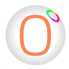
Just a quick test in the launcher, haven't added proper handling of the size yet, so padding is off.
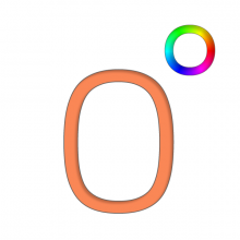
Simple 0° for me too. Looked at my icon bar and noticed the thing might need some BG. Tried with scaling the weights of ring and "0" depending on size, I think a little bit lighter looks more sleek in this size. For a very small icon (16x16-ish), making it into a completely solid pie chart might be the way to go:
Edit: maybe one could use extensions like the lense symbol in order to differenciate certain sub sections of the software?
Looks good, maybe you can prepare some of them as separate files, then i would include them so people get the idea.
Here we go:
For small icons (heavier weight of "0", no hole in the donut):
For bigger Icons:
Could you also upload this images without background, e.g. for launcher, where the buttons are styled by stylesheets? Thanks in advance.
You know what? I'd say the same. Logos/icons is a really boggy area, and there are some great ones - AVID I think is particularly good. Sony vegas emulates it and I'm not sure that's a good idea. Then there are ones like DaVinci Resolve, where, yeah it's a nice icon, but it doesn't really have any relevance to the brand. Adobe have a very good, encompassing theme which makes incorporating new products into their CI very easy, then there's something like Final Cut Pro which is really generic and 90's looking. I'm still open to new concepts but what's happening here seems complementary, relevant and readily identifiable... so... you know. It's also something that would be easy to embellish and add detail to for larger promo material.
Here is the .ai with all the variants in seperate artboards, just for future reference
I think the general idea to integrate the C somehow within the O is a good one. I will certainly meditate about this one.
I like the second and the third one, but second one a bit more, as it's contrast makes it easier to recognize the letter C.
Sorry, I changed the order.
Edit - I'm not sure I'm still pretty keen on the first format.
Update on the Structure view (Dark BG)
OpenCineBackup Icon variations
Updated Opencine Manager Icon to display only two checkboxes
Backup
Backup
^ Thing with that is the numbers woulnd't show if it was smaller. The cogs are here if anyone wants them - https://image.freepik.com/free-icon/data-management-interface-symbol-with-gears-and-binary-code-numbers_318-52331.jpg ... or there might be better ones out there.
^ That's just a guide, it's not exact. What i tried to do was enlarge the boxes and centrally align them.
The following positioning allows for the colour wheel to sit precisely above the spine of the letter P when OpenCine is written fully.
All of the above have used Titillium Light.
PSD files:
I thought it would be smart to recreate these in Illustrator anyways (we probably will need a full vector based verson sooner or later), so I tried to play with the Position of it too. I think there is no need to fine one uniform position for the ° and keeping it across all variations of the logo. In fact I can even imagine the opposite (would also work well for animated logos): move the ° depending on the context.
| From here | to here |
On white:
We definitly need to make sure the Logo works on dark and bright backgrounds. You don't want to know how often I found myself editing Logos of organisations because they would otherwise be invisible in the typical black credits.
Not bad. I like the idea of making a fill inside the O. I somehow dislike the (white) negative shape created between the C and the O, creates the illusion of a sideways cylinder in orthographic perspective.
Great progress guys, now i have to deliver the software, i suppose. Damn the pressure to succeed. :D
