AXIOM Marque Font
Open, HighPublic

Description

I'm not sure about Bebas Neue being included in the apertus CI. It was used on sections of the website and it made some text a little bit awkward to read I think. Particularly where the emphasis is on the onlooker to read something, text has to be very clear and easy.

But this has sprouted up again recently where questions about existing AXIOM camera logos have arisen. See T741

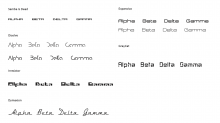
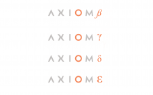
In this area particularly I think the font is unsuitable. This got me exploring our options. I went through approximately 2000 fonts and initially took notice of the attached.

I'd like to explore a little more, but these were the five that immediately stood out.

Base PSD here:

Anyway, I'd be interested to hear your thoughts.
RexOr created this task.Feb 28 2017, 4:13 AM
RexOr updated the task description. (Show Details)
RexOr raised the priority of this task from to Needs Triage.
RexOr added a project: AXIOM Beta Hardware.
RexOr moved this task from Backlog to Ergonomics on the AXIOM Beta Hardware board.
RexOr added subscribers: RexOr, sebastian, BAndiT1983 and 4 others.
RexOr added a subscriber: MichaelH.Feb 28 2017, 4:15 AM
RexOr updated the task description. (Show Details)Feb 28 2017, 4:29 AM
RexOr triaged this task as High priority.
RexOr added a comment.Feb 28 2017, 7:22 AM
This comment was removed by RexOr.
RexOr updated the task description. (Show Details)Feb 28 2017, 7:23 AM
RexOr added a comment.Feb 28 2017, 8:35 AM

We could do away with text all together and employ the Greek alphabet symbol?

We might say "Well if we use just the Beta symbol on promo material people won't know what the camera is."

Well, the word AXIOM would be there, so a quick search and they'd find it.

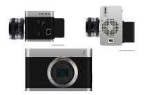
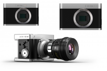
If we intend to drop the beveled finger grip we could employ the side:

... or the opposite corners.

More fonts:

d0 added a comment.Feb 28 2017, 10:44 AM

Is this task a potential duplicate from T741?

The greek alphabet idea is very nice and looks very amazing. I would really recommend considering using it for all the camera models. Especially the "around the corner" idea.

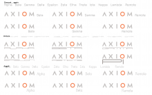
But even if we adopt it, it wont spare us of discussing fonts. I think Bebas Neue is a nice Display font – however this means it is not made for longer blocks of text. I like how it works especially in conjunction with the AXIOM Logo and I am not sure if it really needs replacement. Be also aware that the words "Alpha", "Beta", "Gamma" will always look good in nearly every font, while especially longer words like "Remote" make a fancy font seem ridiculous pretty fast (so I would try with this too ).

I also went through my (open) Fonts (makes no sense to recommend a 600€ font family) and selected 8 additional fonts I found good.


The Exo 2 could also be replaced by the apertus-font Titillium (they are lookalikes basically).
Maybe a lowercase model name is more elegant?
I also like "normal" sans fonts with little typographic ideas like the "P" in "ALPHA" with the Junction Regular or the "H" or "G" in Modeka.
With Oko selected something more far out, but I think I would not be happy to take it because it would annoy the hell out of everybody after 2 weeks.

Im not sure but somebody alerdy mentioned in the IRC that we could possibly have some trouble using greek alphabet. We would do basicaly the same like Sony with their "Alpha".

To the Font question: maybe it would better to decide about our target group First. Do we want something elegant, something "geeky", something clean and simple? What does transport the message of Axiom best? I think this is the main question we should answer first.

I've mentioned it, because of Sony. Their cameras are marked wit Alpha, not sure if other letters are used too.

http://static.trustedreviews.com/94/00002ab06/e416_orh400w630/alpha-a5000.jpg

sebastian added a comment.EditedFeb 28 2017, 9:02 PM

I've mentioned it, because of Sony. Their cameras are marked wit Alpha, not sure if other letters are used too.

http://static.trustedreviews.com/94/00002ab06/e416_orh400w630/alpha-a5000.jpg

I am not a lawyer so I cant judge if we could get into legal trouble with the brand but I would just stay away from doing anything that could even remotely ressemble any similarities simply because we want to clearly differenciate our philosophy and products from anything from Sony. Our cameras are just 180° different direction as what they are creating :)

Im not sure but somebody alerdy mentioned in the IRC that we could possibly have some trouble using greek alphabet. We would do basicaly the same like Sony with their "Alpha".

To the Font question: maybe it would better to decide about our target group First. Do we want something elegant, something "geeky", something clean and simple? What does transport the message of Axiom best? I think this is the main question we should answer first.

Good idea.

I think the harcore geek/hackers choose the skeleton or simple enclosure so the full enclosure we are discussing here is mainly chosen by people that consider themselves more users than developers. I think they still value the background and philosophy of the project but on a less geeky level.

So my vote would be for simple/clean/elegant/robust.

d0 added a comment.Feb 28 2017, 9:29 PM

So my vote would be for simple/clean/elegant/robust.

I am also for it. I think it is like sound design: if it is good you don't think about it, but boy will you think about it if its bad.

RexOr added a comment.EditedFeb 28 2017, 11:17 PM

Sony would struggle to get apertus on the Greek alphabet. Copyright typically has a shelf-life of 70 years and there are stipulations set-up in the legal world that prevent people from copyrighting base characters. Legality takes into account the circumstantial in a case like this - so for instance if we had a red alpha symbol in italics (followed by corresponding numbers certainly) there'd be room for claim. To my knowledge Sony has only ever produced an Alpha. We produced an Alpha but it's discontinued. The Sony Alpha was introduced in June 2006... before the Axiom... However, had the AXIOM Alpha been brainstormed prior to 2006? I don't know. That would all be about proving what's on paper.

The situation around Alpha or Beta would be much like in the automotive world, where characters and their association are commonplace eg. LX, GTS (Guaranteed tremendous safety), GT (Guaranteed Tremendous) etc.

"Greek letters are considered public domain in the same way that the English alphabet is, which is to say that the alphabet can be appropriated to create slogans and names without inherently risking infringement."

If we were enforcing copyright on a Beta symbol, it would be in connection to and dependent on the entire name AXIOM Beta. The same would go for 'Sony Alpha' as opposed to just 'Alpha'.

This is something I think apertus and the community should stand firm on. 'Beta' and the Greek alphabet constitute the entire basis of the naming structure.

All in all, the Beta symbol on the front right would be my preference, with AXIOM on the ports side of the camera - and the reason for that is I did searches today on 'Camera Rig' and 'Camera rig on set' and a majority of user photos are taken from that side, with the lens facing your left. This is also where RED have their logo, probably because they've noticed this being frequent too - I think this sort of thing has come about from camera's like Aaton, viewfinders (like how someone shoots a gun) and the positioning of key people on set.

Where this logo is difficult is because, and if we were to opt for text as opposed to a symbol, it requires finding a font that complements the existing AXIOM font well. That's a more difficult and precise process than it might sound. Fonts are like fine wines or ingredients in a dish, but probably on an even more exaggerated scale. In fact, the whole concept of wedging two different fonts together is the epitome of jarring the onlookers subconscious mind, and companies spend millions testing this sort of thing to reduce the risk of that happening.

I agree it would be good to settle on font families, but for that I'd want to know if we're sticking with 'AXIOM' as it stands, or are you willing to test a new approach regarding fonts for the entire line as well as its respective marques?

Edit - I was in motors for years, that 'GTS' goof is a reference to a Curb Your Enthusiasm episode.

d0 added a comment.Mar 1 2017, 10:46 AM

Very constructive comment RexOr!

Regarding the Sony topic: I am not familiar with international trademark rights, the legal (german) term for it is "Wortbildmarke", which can be applied in the whole EU. This means, we cannot call a camera α because of Sony and we couldn't call a beer α because of the greek brewery Alfa. However we could call some product in a different field α.

The problem is however: we don't know if Sony has the rights for β – they may have entered it as a trademark without using it on actual products, at least Betamax had Beta in it's logo. To be on the secure side one would need a lawyer specializing in international trademarks. Maybe it is OK because β is not the product name but AXIOM β? So we just use the greek alphabet as a numbering system. But again this doesn't matter if you get sued by an international company with an army of lawyers.

I think Bebas Neue is not that bad match for the Axiom logo. However I would really love to have the greek letters. At least for the cameras. Again, it would be good to find some trademarklawyer willing to aid open source. Maybe there are other Open Source projects who know someone who could be of aid?

I'd want to know if we're sticking with 'AXIOM' as it stands

The current AXIOM logo is established and approved, no changes.

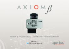
We need a new flyer to print very soon and the logo should be on it.

Waiting for a lawyer to arrive here and analyze the situation is not really going to happen anytime soon.

So if there are no objections I would like to arrive at a decision somehow.

Bebas Neue would be the prime choice IMHO as it is recommended in the official CI, looks good, matches our style criteria we came up with and is well readable.

Thoughts?

RexOr added a comment.Mar 8 2017, 4:01 PM

Yeah, there's something about it that's not right. Things in the CI can be changed surely.

I can be pro-active with a lawyer if it's reassurance you want because like I said above pursuing the Beta symbol would be a worthwhile exercise. But I wouldn't worry unnecessarily in this respect. It's AXIOM Beta that we'd own the copyright for, and copyright ownership is all about proving dates. That would take us back to 2012 is that right? There'd be no crossover hostility - there are about four D70's out there in the camera world.

Yeah, there's something about it that's not right. Things in the CI can be changed surely.

Please elaborate what you find off. Sure we can change the CI but only with good reason, after all we had a pro graphics designer draft this up.

For the reasons I explained already I am against pursuing the greek symbol path and the lawyer but I am happy to be convinced otherwise.

RexOr added a comment.EditedMar 10 2017, 7:20 PM

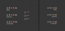
As I went into in chat, two sets of all caps (Line and marque) both with wide spacing. All caps AXIOM we can get away with but ideally you want the sub-category being small case and preferably with a capital B. All caps on both is too off-putting for the subconscious. It might look ok to begin with but I question its staying power.

I don't like any of those.

Third one maybe.

https://fonts.google.com/ has a pretty good selection.

RexOr added a comment.EditedMar 10 2017, 7:49 PM

You've got to realise I've been through about 10,000 fonts at this point, that's getting exhausting and not much seems to work. As a result I keep coming back to the symbol. As per:

Note: We couldn't do AXIOM on the side, so if we didn't put it on the front it would have to go on the rear... or the opposite side, at which point it would make sense to move the symbol on front over to the left... maybe (so that from an angle both the line and the marque were visible).

From IRC:

I'm trying to give the demographic the benefit of the doubt, that they're intelligent enough to become accustomed with the naming structure, and, I think all of this comes down to a presence being built up. The ingenuity of the product, how distinguished it is, or how it/they can distinguish themselves against other devices, is what's key... So in that sense it would be up to us to carve that niche out. As far as I'm concerned apertus is already doing that. So where I was coming from was that we should be confident in that naming strucure, let the gear speak for itself, grow on that reputation, and in turn dominate this aesthetic appeal. ie. Take the alphabet symbols for ourselves. That we shouldn't be going out of our way to do Sony any favours - on that note, people are intelligent enough not to call the Sony Alpha the Sony A cam.

It was also mentioned that we aim to do things differently.

That the logo needs to be "simple/clean/elegant/robust/timeless" ... and nothing does this better than the symbol it seems to me.

You've got to realise I've been through about 10,000 fonts at this point, that's getting exhausting and not much seems to work. As a result I keep coming back to the symbol.

The symbol also uses a font.

RexOr added a comment.Mar 10 2017, 8:20 PM

True, and we could make them ours (have them designed to deviate away from the standard)... In the above image [edited] I just went for the standards.

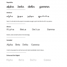
I'm not keen on quite a few of the fonts, tbh. They fall into novelty genre (Republika, Omikron, Oloron, Enahnced Dot Digtal).

Centabel contrasts quite well with the AXIOM typeface but might be too traditional.

Greycat is quite 1980's scifi. Univox is too stylised and hard to read. Asgalt has bad kerning, 'Z eta', 'R emote' etc.

On the issue of copyright - never underestimate a US judge or the USPTO to impose restrictions on a non-original broad design idea... (see Apple's slide to unlock ruling)

Here's a few tests with Titillium at different sizes and alignment:

RexOr added a comment.Apr 10 2017, 3:17 PM

It's very confusing to me why people tread on eggshells where copyright is concerned in this area. The Greek alphabet is removed from copyright restrictions in the same way that letters of the alphabet are. 'Slide to unlock' is a patent, letters can't be patented.

db added a subscriber: db.EditedJun 29 2017, 7:32 PM

@RexOr:

"He fired his first lawyer when she recommended that he accept a settlement offer that would have forbidden WalletHub from using any form of a single letter W in any future trademark application. He’s now two years deep into a trademark dispute with one of America’s largest sports leagues. “You can’t own a letter,” he insists. In a way, he’s right. But in a way, he’s very, very wrong."

https://www.fastcompany.com/3042515/wtf-inside-the-wild-weird-world-of-trademarking-the-alphabet

RexOr added a comment.Jun 29 2017, 8:23 PM

Interesting read.

"Single letters are among the most popular trademarks registered in the United States. Each letter of the alphabet has, at a minimum, hundreds of trademarks. There are, for example, over 2,000 trademarks of the letter S, making it the most popular. There are 1,102 Vs, 1,100 Es, and 1,816 As. Pity the lonely Y, with only 229. For comparison, other common words have far fewer marks: “me” has 97, “cat” has 72, and “extreme” has only 42."

AXIOM (and then the Greek alphabet symbol 'beta') isn't a single letter of course, it's a word 'AXIOM' in all caps, with the Greek alphabet symbol 'β' adjacent to it.

Sony has used the 'β' symbol on their equipment and it was registered with the USPTO:
http://tmsearch.uspto.gov/bin/showfield?f=doc&state=4805:uv244z.5.5
"Video Tape Recorders, Video Cameras, Projection Televisions and Video Accessories"

It was cancelled in March last year, but:
"Just because a mark is listed as “dead” at the USPTO, does not mean it is available to use without registration, or to register. It's possible that the registrant of the trademark abandoned the federal trademark registration, but is still using the mark – and so still has common law trademark rights."
http://www.yospinlaw.com/2015/05/18/can_i_register_or_use_a_dead_trademark/

So it's all far from clear cut.

Another interesting read - Apple also won a trademark dispute against 'Pear Technologies':
https://www.theregister.co.uk/2017/04/27/apple_lawyers/

  • different business sector (digital mapping software)
  • different fruit (pear)
  • different key design element (no bite mark)

"If all that isn't a textbook illustration of how over-paid lawyers use fancy words to try to hide a mountain of horseshit logic, we don't know what is."

"But Apple won. Not only with this logo but also with another Pear Technologies logo that bears even less resemblance to the Apple logo. A pear made up of lots of different-sized squares no less."
https://oami.europa.eu/copla/trademark/data/013115076/download/CLW/APL/2017/EN/0860-2016-5.pdf?app=caselaw


...and this wasn't the decision of a U.S. Judge, it was the European Union Intellectual Property Office (EUIPO).

There's no way to protect against this type of dispute.

RexOr added a comment.EditedJul 22 2017, 1:01 AM

Personally really keen on the Greek symbols as you know, but when it comes to potentially lining the pockets of law people and those who stand to gain financially from legal procedures, that's when I'd get really turned off.

In terms of simply differentiating one device from the next, and alongside the name eg. AXIOM Beta, much more obscure character sets could be a good way to stick our fingers up at those systems of course.

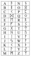
eg.

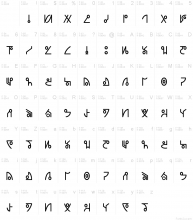
AXIOM could have its own alphabet even.

There's something really appealing about a single character. Works well on a lot of fronts. If we're striving to do things differently, well you can't get much more different than that.

This comment was removed by ZKGoodwin.
RexOr added a comment.EditedSep 20 2017, 7:42 AM

Centabel

Sander Kessels - http://www.lollibomb.com/ / https://twitter.com/lollibomb?lang=en

Centabel is a basic, serif font designed by Sander Kessels. The font is licensed as Free. The font is free for both personal and commercial usages.

Download from - https://www.urbanfonts.com/fonts/centabel_book.htm

It has quite an unusual small 'b' but the only time that's encountered in the Greek alphabet is 'Lambda' or 'L'.

I prefer the orange color of the text of Beta. My reason is so that you can disnquish it easier.

ZKGoodwin added a comment.EditedSep 20 2017, 10:08 PM

Something like this looks better to me.