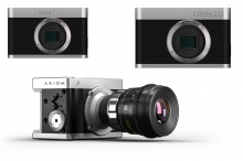
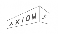
AXIOM Beta/Gamma/Remote logo design
Open, Needs TriagePublic

Description

We don't have a logo layout for the AXIOM Beta, Gamma, Remote devices, so it'd be a good idea to think about a unified design that works equally well for current and future products.

considerations:

  • should work well with different length product names
  • needs to look good on screen and printed/etched onto products
  • maybe have two variants; horizontal and vertical/stacked?
  • non-colour versions? black/white & greyscale
  • padding around the logo and the location/alignment on the products

current logo definitions: https://www.apertus.org/logo

Some discussion took place underneath Michael's renders here: https://lab.apertus.org/M4#181

intracube updated the task description. (Show Details)
intracube raised the priority of this task from to Needs Triage.
intracube added a subscriber: intracube.
intracube updated the task description. (Show Details)Feb 23 2017, 10:44 AM
RexOr updated the task description. (Show Details)Feb 23 2017, 4:52 PM
RexOr added a subscriber: RexOr.

The custom AXIOM typeface seems to be close to this font: https://www.fontyukle.net/en/Litera-Heavy.ttf

d0 added a subscriber: d0.EditedFeb 26 2017, 5:46 PM

I would use the AXIOM logo as it is, and do the variant (Beta, Gamma) using Bebas Neue which the the Axiom CI says should be used. The font weight will have to be discussed, but should also be dependend on the actual real world size of the font: if you use "Axiom° Beta" on a quite big homepage you could use a` Light` font weight for "Beta", if you however etch it on aluminium with 10pt, you should definitly use at least Regular or Bold.

I propose to center the variant under the O, mostly because it looks better in color : )

Edit: one could also try with the Titillium font, but I somehow like the Bebas for this

Nice work!

Once concern though is that if the etching in the enclosure is small the subtitle "Beta, Gamma, Remote" might be too small to be well readable.

d0 added a comment.Feb 26 2017, 6:40 PM

Once concern though is that if the etching in the enclosure is small the subtitle "Beta, Gamma, Remote" might be too small to be well readable.

That is why I said one has to adjust the weight of the font according to the size: if you go smaller in size the font needs usually needs to be stronger (no matter if it is etching, print or screen).

Also the ratio between the Camera Name and Camera Variant could be changed for very small prints. What absolut size would you use in etching?

That is why I said one has to adjust the weight of the font according to the size

Right

What absolut size would you use in etching?

Not decided yet but I guess something in the range of 2-4cm width.

d0 added a comment.Feb 26 2017, 9:02 PM

40mm width is readable from a distance of ~4m for me.

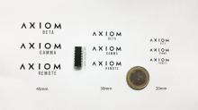
Here a size comparison

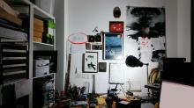
This was the distance from which it was still readable for me at 40mm. If it is 20mm I would resize the smaller font. (See red circle, ignore mess)

Bertl added a subscriber: Bertl.Mar 1 2017, 12:21 AM

sorry but still not convinced of the greek symbol, bebas neue still has my vote.

RexOr added a comment.Mar 10 2017, 2:48 PM

Do you wanna put it out to the polls?

You talked about a professional logo designer, but I'd imagine that he/she didn't put Beba Neue up against the AXIOM Logo as it stands.

I also don't like the greek symbol. It don't fits the other used fonts.

RexOr added a comment.Mar 10 2017, 7:16 PM
This comment was removed by RexOr.

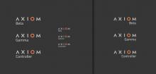
d0 - I like the Bebas Neue ideas. The different proportions are a nice contrast. Here's a quick test using Titillium:


But maybe Titillium is too bland and indistinct from the AXIOM typeface.

RexOr added a comment.EditedApr 11 2017, 12:50 AM

It would need to be better than that... but, you know... it's a logo.

Edit - Not that I'm sold on it myself you understand. I'm just working through ideas.

Just thought I would point out that the AXIOM logo in the logo pack as provided at github is cropped at the bottom:

I am using this logo for the loading image on the vue.js version of the WebUI. So I fixed it (in my repo) but also forked the repo and created apertus_Logo_Pack_V2.2b.tar.gz with the fixed logo. I just made a pull request from our fork.

Old (535 kb):

New (357kb):

RexOr added a comment.Feb 23 2018, 6:23 PM

Good man. There's a new logo pack presently building.

Bertl added a comment.Feb 23 2018, 6:26 PM

@RexOr Note that the symbol you are using as 'beta' is most likely an sz ligature (or sharp s) and not a greek beta as the beta does not have a serif or swash at the bottom while the long s from sz has.

β (β U+0392) vs ß (ß U+00DF)

Best,
Herbert

PR merged, thanks!