Mock History
| Current Revision |
|---|
Looks great, I can't think of anything to change anymore!
We could add matching style PCB labels though, see https://wiki.apertus.org/index.php/File:PCB-Stack-Concept-V03-022.jpg
I liked the strong perspective of the PCB-Stack-Concept-V03-022 and the colorized black ink style very much.
This one looks to much like a preview rendering for a photorealistic model.
Also IMHO having one plugged in module and one detached illustrates the 'plugin' aspect quite well.
So my wishes would be:
- stronger perspective
- a little less detail
- colours and labels for each part
- black inked edges
Don't get me wrong, I'm not saying that it isn't great!
Best,
Herbert
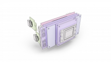
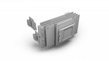
So here are to other versions according to Bertl's suggestions. Alltough the colored version went a little dark on the side (must have lost a light somewhere)
Yes, the grey version looks really nice, so if the color version had the same lightness (or maybe a tad bit brighter) it would be almost perfect :)
Still missing the labels for each part, but I guess that will be added later as a separate layer?
Two more feature requests though:
- Can we show the fingers on the detached plugin? Just a few lines to illustrate them.
- Can we make the sensor front flat? (i.e. have less detail on the front)
Note: I wouldn't mind if the plugins were empty (generic) and not carrying an HDMI connector (specific), but the current version is fine as long as the connectors do not get too detailed or dark.
Thanks for perfecting this!
Appreciated,
Herbert
Ah, I just realized that the shields have more holes (4) than in reality (2) which needs to be corrected.
Thanks,
Herbert
New images are online. I've tried it with the hands, but that looked somehow wierd, especially when the labels are also there.
Hands? What hands?
I realize now, that my comment was probably misleading to somebody not intimately familiar with PCBs and edge connectors in particular :)
What I meant with 'show the fingers' are the typically gold plated circuit parts on the edge connector where the PCB goes into the PCIe slot, as can be seen in this image on the right side.
And to be more precise here, a few lines (not necessarily the correct number) should be more than sufficient to 'illustrate' the edge connector for the detached plugin.
Image looks nice, the orange squares are weird for me at least on the coloured version.
Plugin Slots are called 'North' (top) and 'South' (bottom) and Shield Sockets 'East' (small side) and 'West' (plugin side).
I'd love to see it with slightly more pastel colors though.
Thanks a lot,
Herbert
Haha, and I was sitting there, trying to get some hands drawn, pulling out the module :)
I thought that's what he meant too... Like a Fairy washing-up liquid advert - http://l7.alamy.com/zooms/5833b0c62d874262b0d596b5fd87cf81/original-vintage-advert-from-1940s-advertisement-dated-1947-advertising-fgkmy0.jpg
Looks great, excellent work.
I have to admit for my own taste the gray variant is my favourite as the green, blue, red, violet saturation makes it look too colorful which for me gives the impression that the visualization less technical than it actually is.
Can we maybe try a colored version with a palette picked from our CI https://www.apertus.org/logo ?
I know our actual oshpark boards are violet and the microzed is red but the actual PCB colors are not that relevant in this vizualization IMHO.
It looks to me like the CI palette features a number of similar pastel colours, so that would work without changing the colour tone on the boards too much. E.g. secondary set, third colour (the red) and ternary set, the last two colours should be almost perfect for the MicroZed and OSHpark boards. The plugins could use the green from the secondary or ternary set, whatever looks better.
Note that I don't think that it is relevant, as it still is a 'separate' picture and I don't think you pick the images according to the CI either, or do you?
I also think that reducing the saturation will benefit the technical visualization (i.e. make it less realistic)
All the best,
Herbert
@MichaelH would you be so kind and upload the source files (photoshop?) of the latest designs so Ray can incorporate the stack up in the flyer: https://lab.apertus.org/M11/35/


this blocky part is a left over from an enclosure design. please remove