See Pholio for updated mocks.
Description
Description
Comment Actions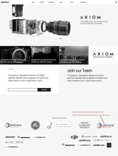
If you're anything like me then you're probably not overly keen on commercialisation. Advertising can be pretty vulgar let's face it. In fact, I'd go so far as to say that I'm averse to advertising. However, and from what I've picked up so far, funding for development is sorely needed. At this stage some advertising is probably a good strategy.
I'd like to start a drive for sponsorship, but something that can be important when doing this is the ability to give something back in return for investment. Now, current and previous sponsors are being name checked on the site and that's good, but if we were able to spotlight investors a bit more centrally I think they'd appreciate it.
I know this can be done because I've done it before. I used to charge manufacturers over six and twelve months through a set pricing structure in return for their being featured. A set pricing structure probably wouldn't be a good idea in this case because there you're inferring an importance on traffic primarily, which is what all manufacturers are concerned with in this scenario typically. Rather than numbers related to traffic, I think a manufacturer's being seen to support a project which has the best interests of film makers at heart is what I could sell best.
See the attached image for an LP concept (if it were up to me I'd make these logos smaller than they're pictured, I've just knocked this up to demonstrate) - So you'd have between four and eight primary project sponsors on the top row, and five or six rows (hopefully, if you choose to run with this) of smaller supporters. All logos would be hyperlinked, and greyed out for subtlety, besides which ever logo a viewer had their cursor on.

Comment Actions
But this tactic would do three things at the same time. It would generate some funding, give sponsors something back, and it also encourages other firms to contribute alongside counterparts.

Comment Actions
A few days ago on IRC I said that I'd had second thoughts about clogging up the LP with logos, and that one line of main project partners and another for 'as featured in' might be more appropriate.
Wanted to bring this back here as an example of a complex but well designed website which demonstrates tastefully what I described with the greyed-out logos on the landing page.
Perhaps 'oranged-out' might be worth looking at.
Comment Actions
@nils are you making progress on the design? can i see the current state?
I'm working on the site structure: https://lab.apertus.org/T662
Would it be possible to play around with it and move elements around?
Comment Actions
If anyone is landing on this task it would be a good idea to speak with one of us as a lot of mocks have been done and structure, whilst nothing is necessarily final, has moved on a lot since the pictures in the OP were posted.
Wanted to drop this site in here - https://visitmaine.com/quarterly/thoreau/exploring-nature
... and draw attention to its static background and scrolling elements (starting at about half way down the page), which, whilst their transitions aren't as fluid as they could be, could work well for article/about pages.
Also, if renders of PCB stack components is scheduled to continue then something akin to what's been done here - http://www.fiftythree.com/pencil ... from about 45% down the page, would be great.
This comment was removed by RexOr.